
Banner Images
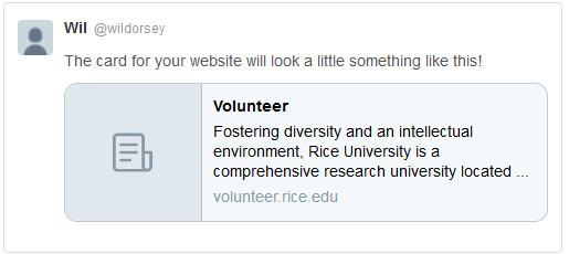
At this point in time, our web banner styles vary from site to site and even from page to page. While this approach gives us the illusion of flexibility, it adds a level of confusion to the design process and requires the web team to constantly tweak the banner functionality to accommodate the changing styles. We need a new set of standards to use when creating web banners that will look good on both desktop and mobile platforms while also behaving correctly when linked on social media platforms. While most of our banners are acceptable on desktop and mobile, they are not optimized for sharing with social media. Our basic banner size (1900x500) is not the correct dimensions which prevents it from being pulled. Here are some examples of what we have tried in the past:
Full width banner that does not resize with screen
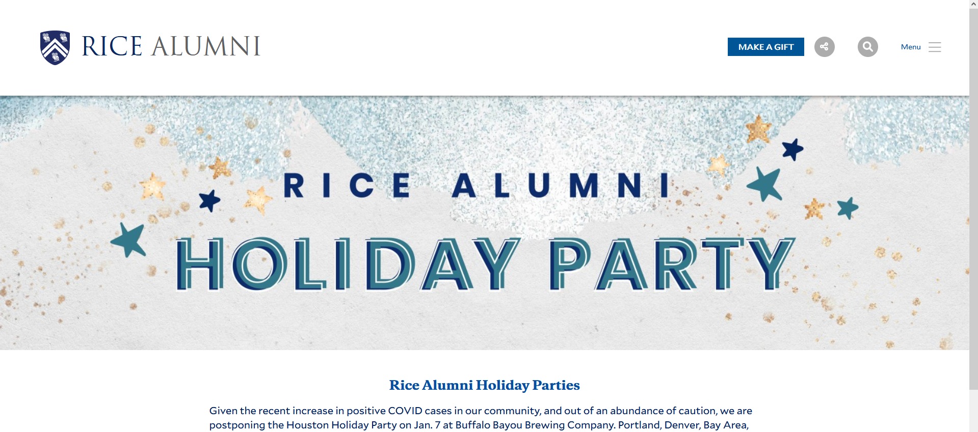
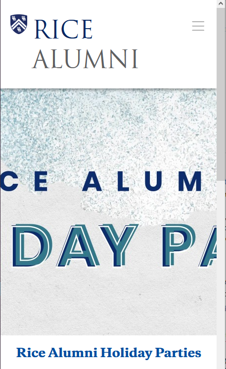
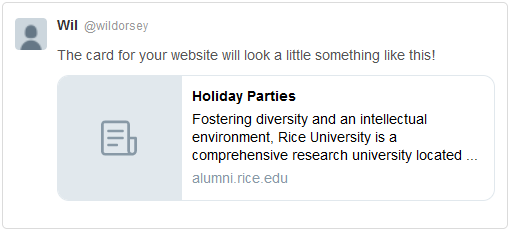
This approach tries to plug a banner meant to resize with the screen into the basic Drupal template. Our Drupal templates are not designed to display banners this way out of the box, so the sides of the banner are cropped out as the screen size is reduced. If this was optimized for social media platforms, it would still crop the sides of the image until it fit within the preview section.
Example: Holiday Parties
| Desktop | Mobile | Social |
|---|---|---|
|
|
|
|
Full width banner that resizes based on screen
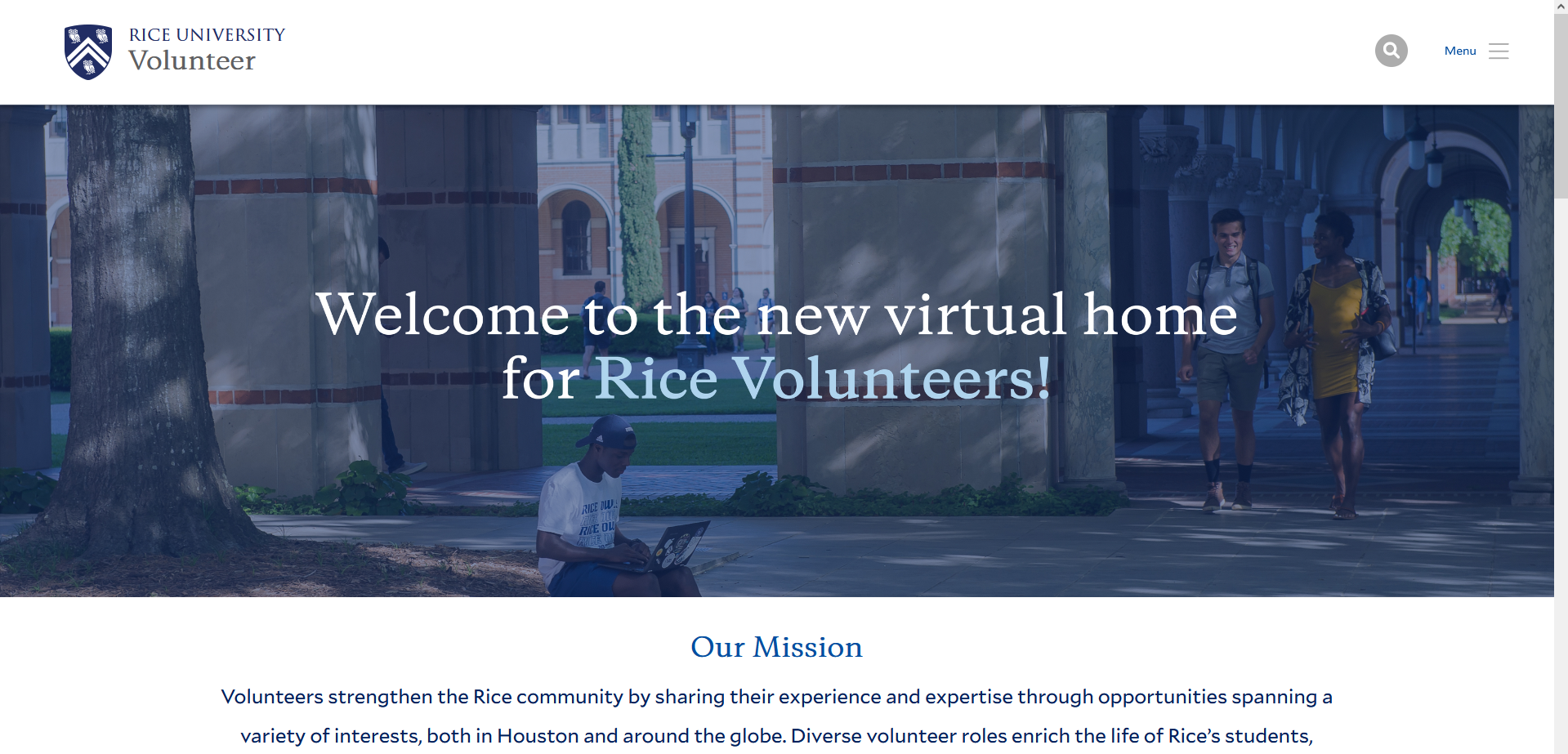
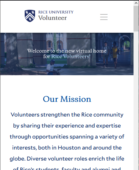
This type of banner will reach from one end of the screen to the other and maintain it's width:height ratio. This avoids any part of the banner being cut off for mobile platforms, but does not allow enough space for a text overlay. If text is embedded in the image itself, it is resized with the image and becomes too small to read. Optimizing for social media sharing would lead to the same issue as above.
Example: Volunteer Homepage
| Desktop | Mobile | Social |
|---|---|---|
 |
 |
 |
Separating text overlay and banner image
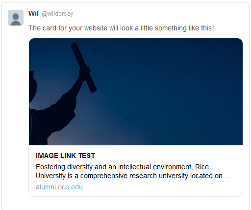
This style uses the built in Drupal functionality of having a live text overlay for the banner section, but only uses a basic color for the "banner." The banner image itself is placed in the main content area.While this allows us to have a banner image with a subject to focus on, it looks clunky and the main content is pushed much further down the page than normal. If this was optimized for social media sharing, you would only see the color used in the actual banner section which is not ideal.
Example: NESB Site stories
| Desktop | Mobile | Social |
|---|---|---|
 |
 |
|
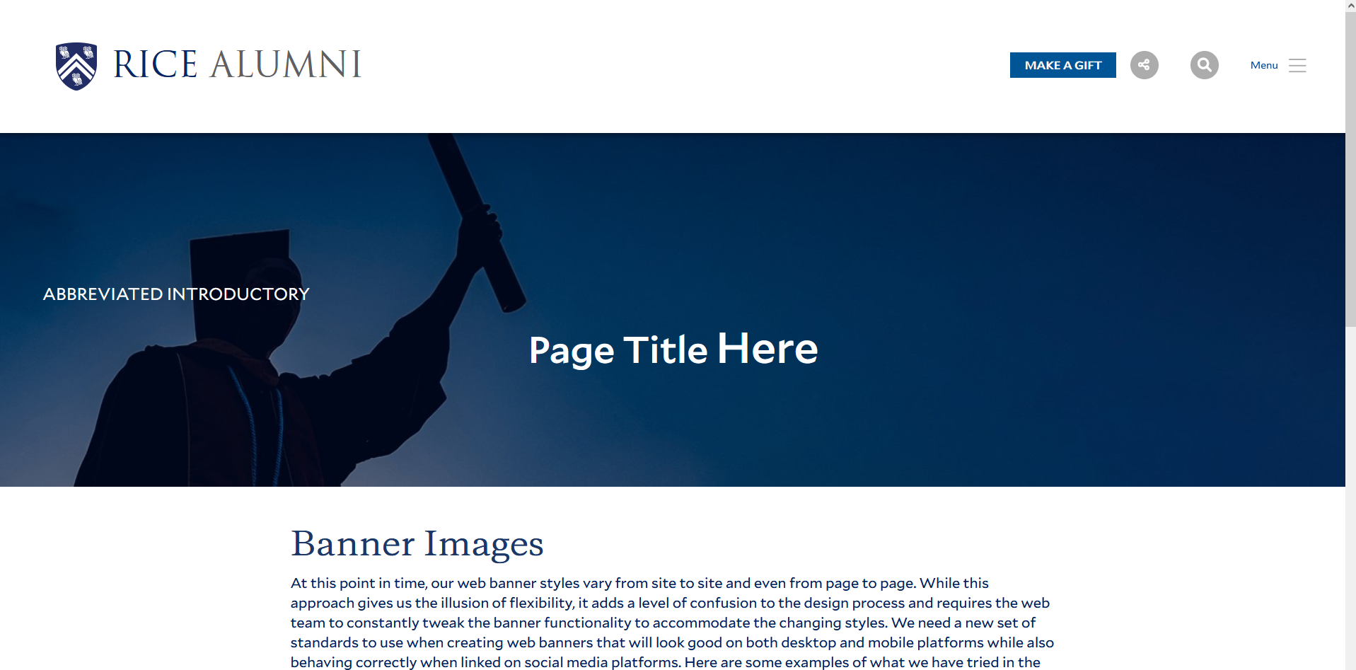
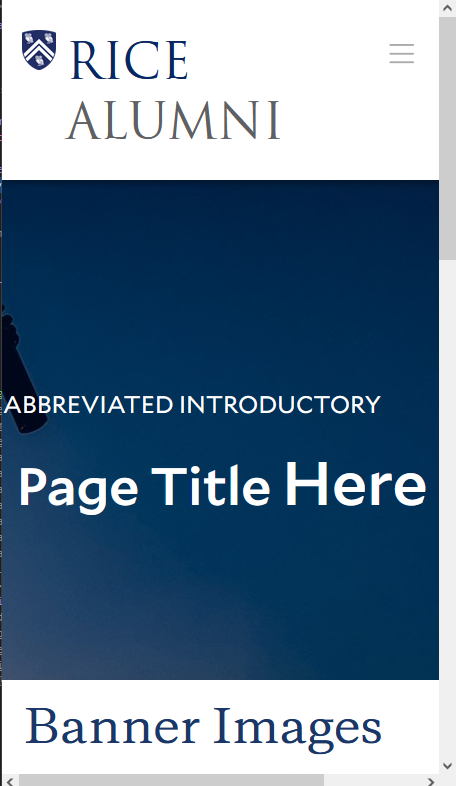
SOLUTION: Live text overlay on banner with no subject focus
In order to alleviate these problems, I propose that we change our standard banner image size to 1600x500 and fully lean in to the way our Drupal templates handle banners. Using a live text overlay will improve our pages' SEO, accessibility, and user experience. While this may appear to limit our options when creating banners, it will help our designers by allowing them to focus on one style of banner and also give us the flexibility of embedding assets that would normally be reserved for the banner throughout the page.
Example: This page
| Desktop | Mobile | Social |
|---|---|---|
 |
 |
 |